By the time Gwins came up, the studio had a working theory — the art is what people see, but the system underneath is what decides whether a collection becomes a community.
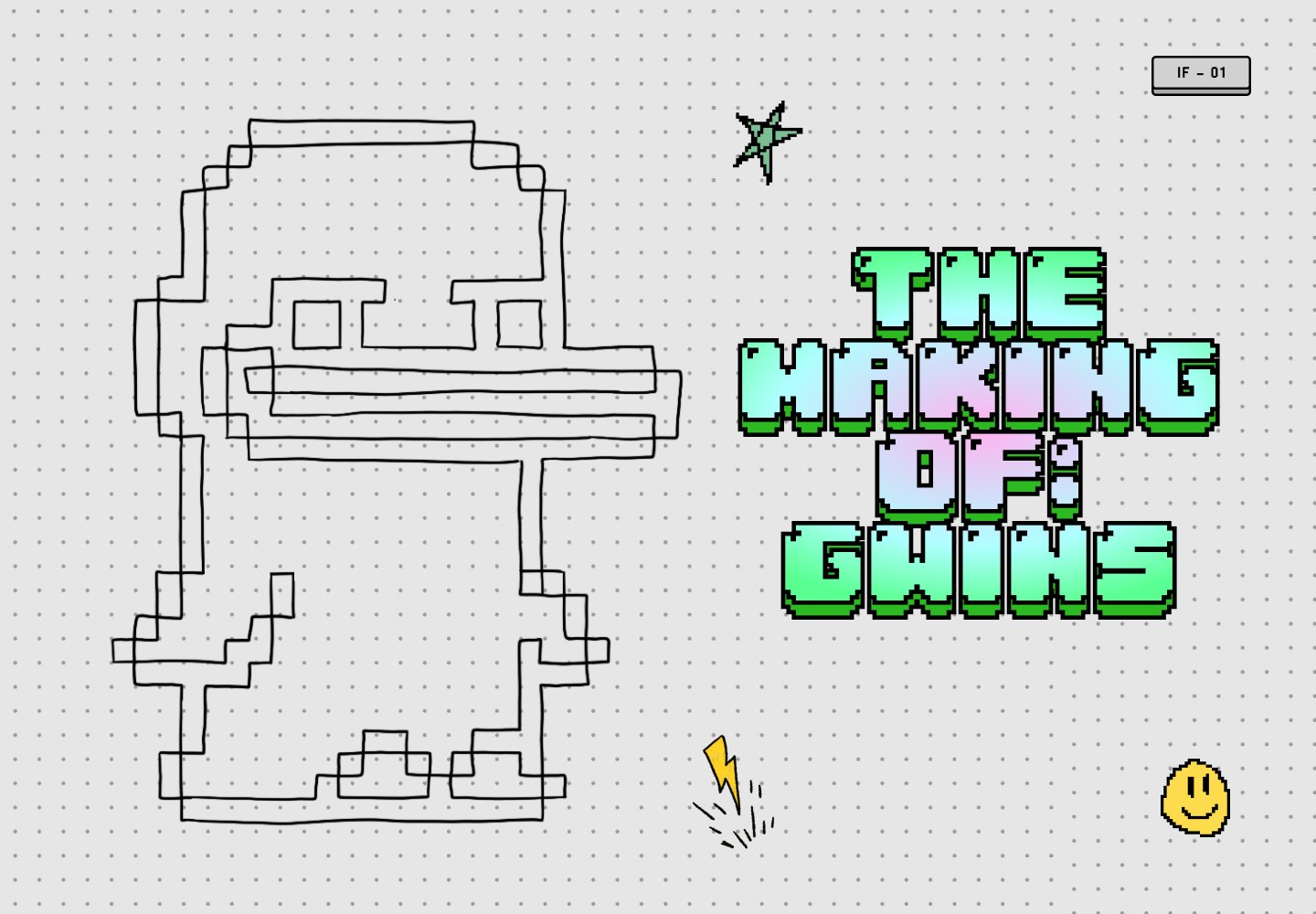
The eleven chapters that follow are the system, made visible. Working name for the project: PENG.

What people actually see — the wordmark, the cast, the launch — is a fraction of what gets built. Below the waterline: the archetypes that hold the cast together, the world the cast lives in, the physical objects that anchor the digital ones, the visual framing that decides what the project even feels like. The iceberg is the operating principle.
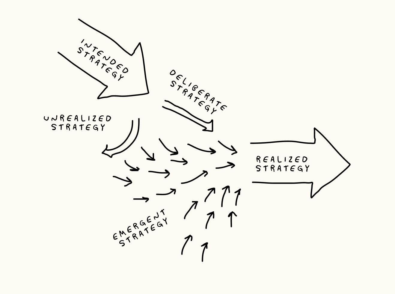
Henry Mintzberg's strategy diagram. The top arrow is the plan; some of it gets dropped (unrealized), the rest gets executed (deliberate). What ends up shipping is also shaped by emergent decisions made along the way — the strategy you didn't know you were having. Gwins' design followed this curve almost exactly.
The first cast were rough penguins drawn at small pixel grids with flat fills. Working name: PENG. Already the silhouettes had personality — the slouch, the sword, the funny hat — before any of them had ears, fur, or shading. The art was figuring out what kind of creature the project even wanted.
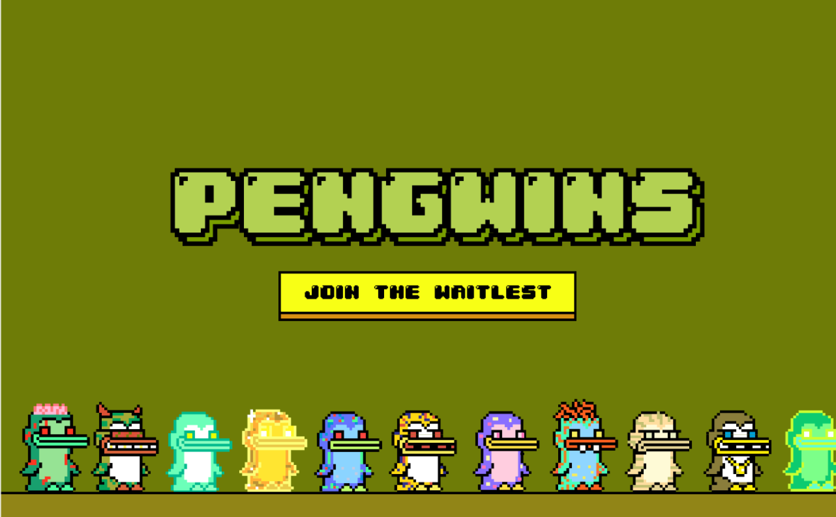
Left: the project briefly went by PENGWINS — pixel wordmark, but the world wasn't there yet, just a Join button on a flat field. ('Waitlest' never left staging.) Right: the name shed a syllable, the wordmark sharpened, and a desert mountain landscape moved in behind the type. That backdrop wasn't decoration — it was a worldbuilding commitment that would shape every archetype to follow.
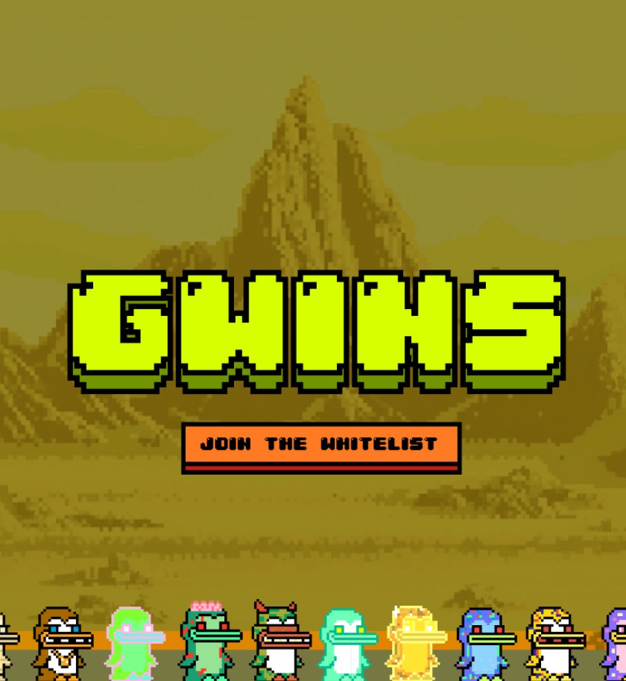
Gwindom got a map. Castles, dungeons, mountains, forests, rivers — geography that does work. A Mobster Gwin from Gwindom Heights reads differently than a generic mafioso pixel.
The first archetype pass was scattered — Suits/Fancy, Blue Collar, Classic Mythic, Elemental, Coder/Web3 — ad-hoc clusters that emerged from the cast itself. The editing pass tightened them. The shipped index settled at fourteen archetypes: Normal, High School, Worker, Coder, Military, Pirate, Athlete, Science, Western, Mobster, Ancient, Zany, Creature, Undead — and every one of the 100 Gwins lives in exactly one. The same pass back-applied late-cast techniques (shaded pixels instead of flat fill, consistent line weight) to the whole hundred, so the collection reads as one piece, not a hundred.
Physicals are how a digital drop earns a place on the desk. Gwins shipped two: a high-quality poster headlining the Reaper Gwin against a thumbnail of the full cast, and a trading card series with all 100 rendered in cardboard-and-foil aesthetic. A different physical for every future Infinite Fun launch — the poster is the Gwins stamp.
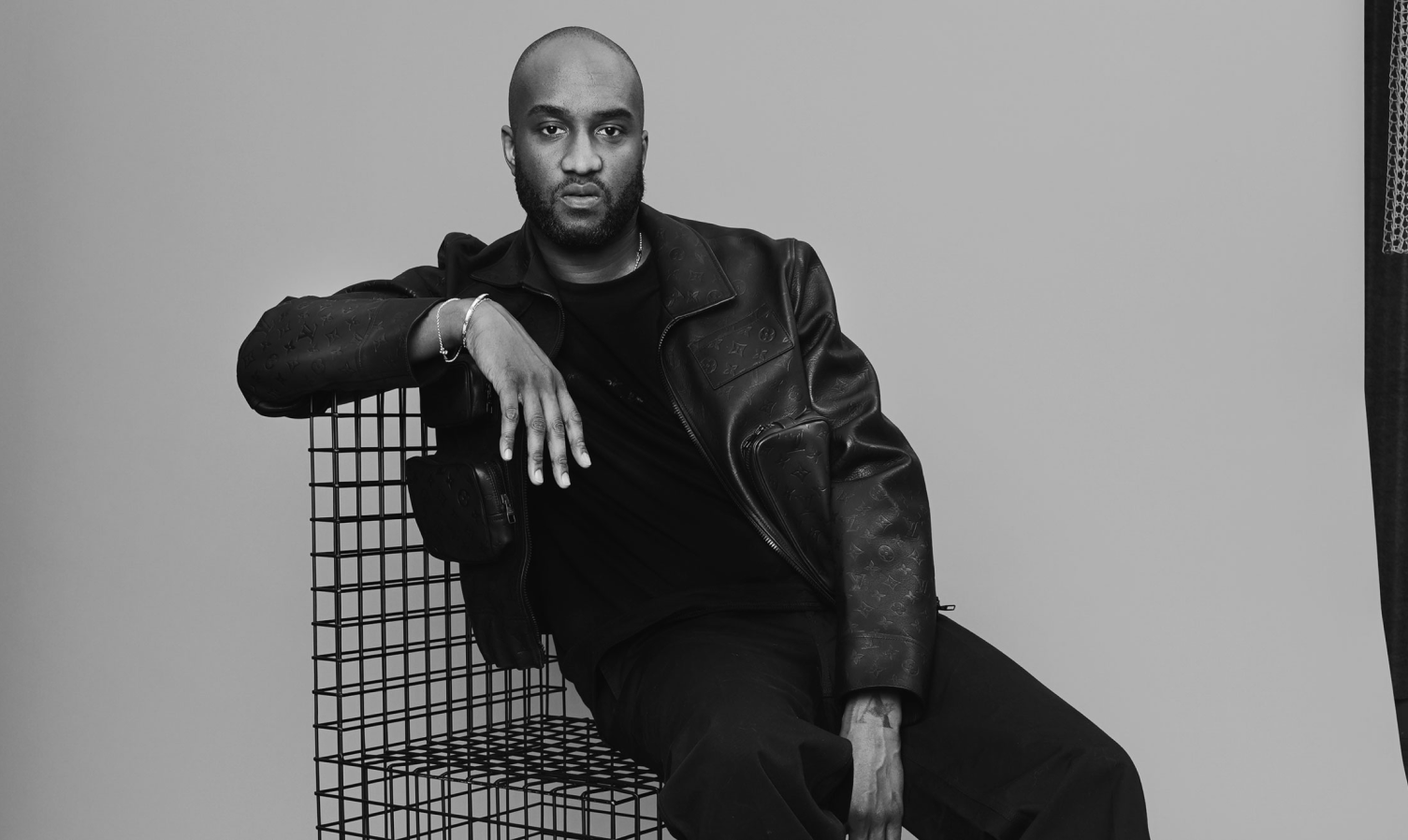
How a thing is presented decides what people read it as. Infinite Fun took the Virgil Abloh playbook — that the framing matters as much as the object — and ran it on Gwins.
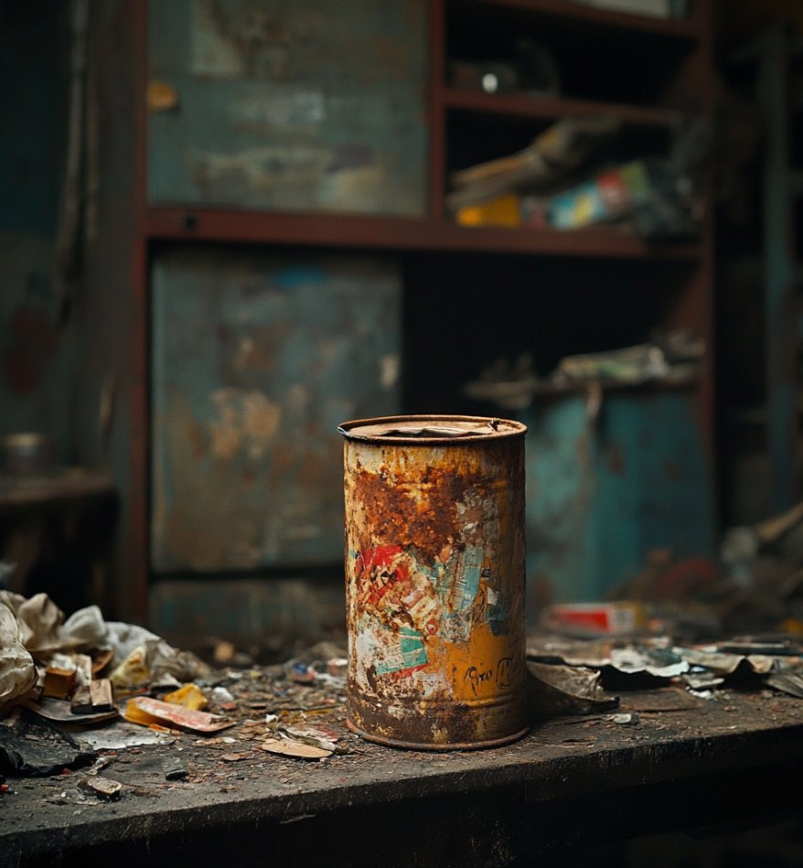
The framing around the object is almost more important than the art. Take a rusty can — in a dirty garage it's trash. In a museum it can now be "art".
— jonny
The branding was the flip. The cast itself is grungy and weird — mutant penguins with cracked teeth and patchy fur. The wrapper is the opposite: hand-set type, riso textures, primary colors, kitchen-table craft. Trash and museum, side by side.
The rollout: handheld camcorder grain, voiceover from the team, desert backdrop. Same flip — high-effort production made to look low-stakes. Nostalgic, crafty, deliberate.
That was Gwins — the design, the wrapping, the world.
The 100 Gwins are live on Solana. Two physicals shipped. One studio is already onto the next drop. Studio at [infinitefun.art].
Stay gwinning.
— jonny, project lead
- sircandyapple, artist on Gwins"Was a fun whirlwind of a month making this!"
- PixelRainbow (33.3%)Can't spell GWINS without "WIN"!